Description
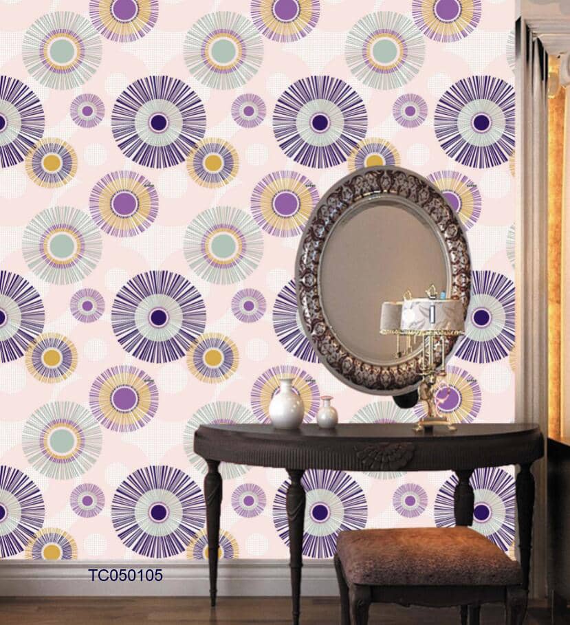
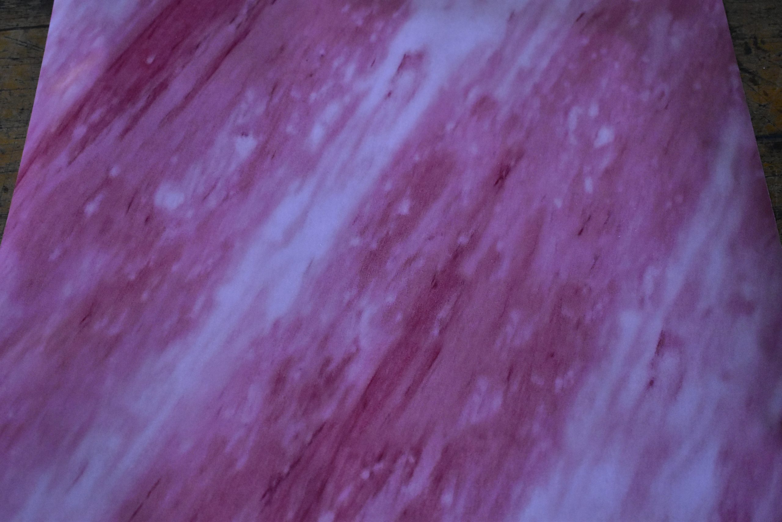
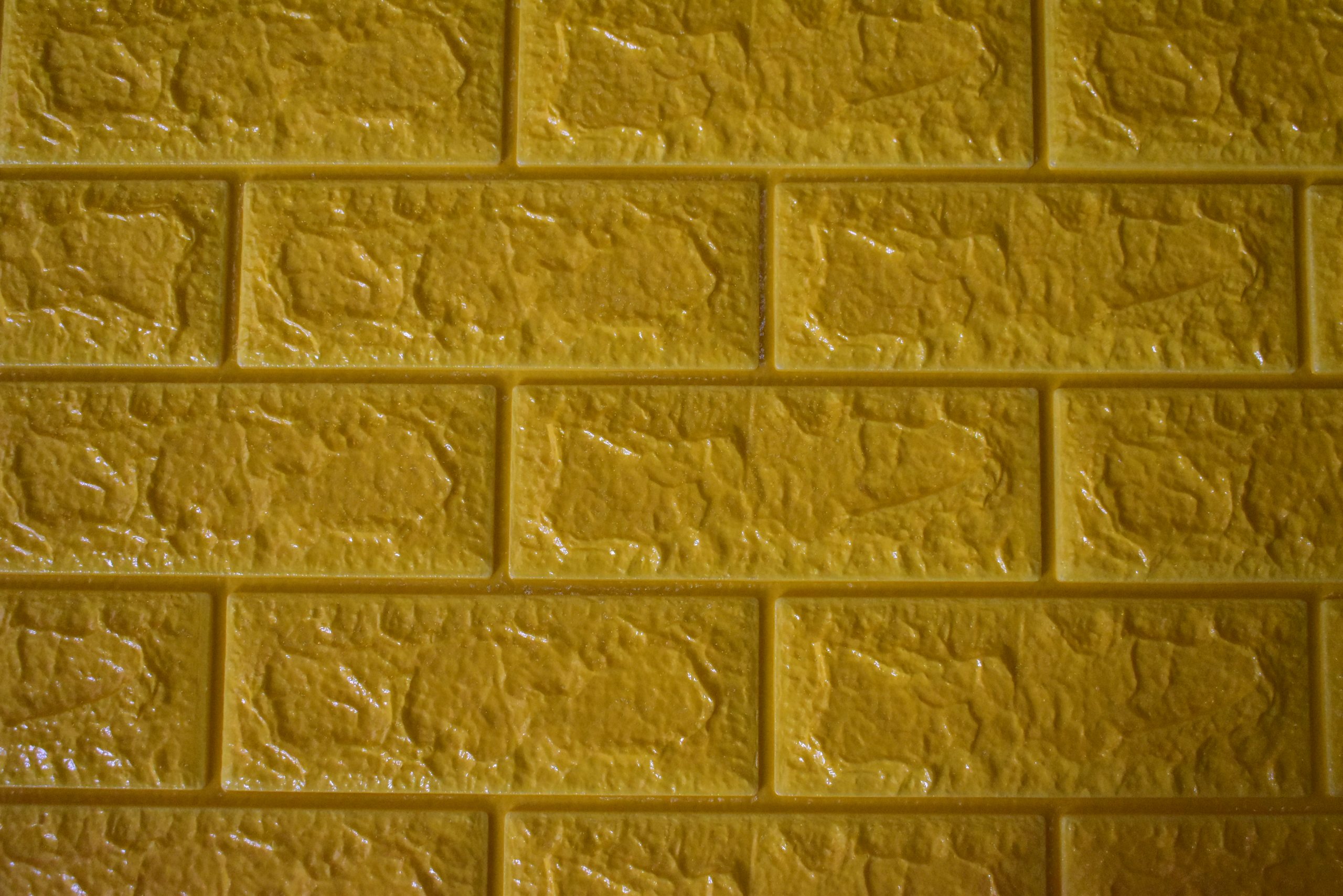
The purple and yellow wallpaper is a perfect example of how to make complementary colors work for your interior decoration.
As they say, seeing is believing. But if you are in doubt, there is scientific evidence.
See how purple and yellow wallpaper colors are especially pleasing together.
Before you dismiss this as an urban myth, here’s the scientific evidence supporting it.
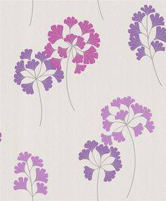
Take a look at the purple and yellow wallpaper colors looking good together here below.
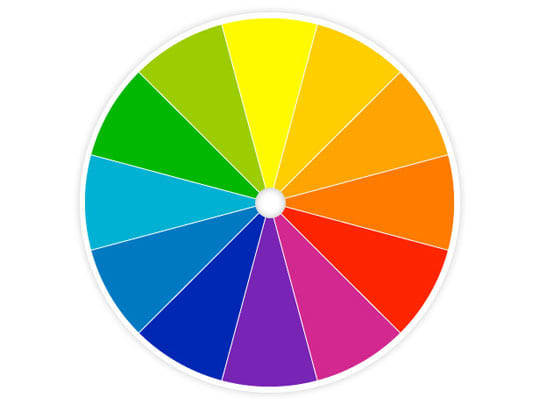
In design, visual arts, or interior decoration, color theory, as appears in the color wheel, is the guidance to color matching.
And also to contrasting, mixing, and the visual effects of specific color combinations such as purple and yellow.

The color wheel and Conventional color wisdom show you that colors that lie opposite one another on the wheel—or complementary colors, as does purple and yellow—are especially pleasing together.
The combination of purple and yellow wallpaper colors symbolizes royalty and brings joy and smiles to all of us.
This is an amazingly striking wallpaper color combination that is a feast for your eyes and a conversation starter for your guests.
Ask for more designs of purple and yellow wallpaper available at Wallpaper Kenya.
Pastel Purple and Yellow Wallpaper
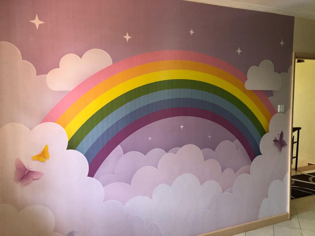
Pastel purple and yellow wallpaper can be used for much more than murals.
Its application covers multiple sectors, such as interior design, fashion, cosmetics, confectionery, entertainment, and many more.

As cute as they are, pastel colors can be just as powerful in wall decoration when used well.
Pastel yellow
Unlike bright yellow, which exudes liveliness, optimism, and enthusiasm, pastel yellow is a bit calmer.
Even in its lighter forms, this color is cheerful and welcoming in designs.
It’s an excellent tool for adding a pop of color to neutral or dark backgrounds.
But it can be just as competent on its own.

Canary yellow, daffodil, banana, and creamy corn are some examples of pastel shades that are often used by companies.
Thanks to its relationship with the sun and summer.
This color is preferred by travel agencies, tourism companies, and ecological brands.
pastel purplePastel violet owes its unique charm to its ability to combine the calming, grounding energy of blue with the friendly warmth of red.
That’s why it’s the perfect option if you want to have the best of both worlds in your designs.
Its sumptuous appearance has made the color synonymous with wealth, nobility, and royalty.
But depending on the context, violet can also represent wisdom and creativity.

This pastel offers many pleasant shades, some of which are mauve, lavender, lilac, etc.
Violet is widely used by luxury fashion brands, creative agencies, and the beauty industry.
Different shades and designs
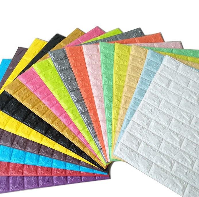
Purple and yellow wallpapers are quite common in design as the colors are considered to be complementary.
This means that when the color waves of these two colors merge, white is formed.
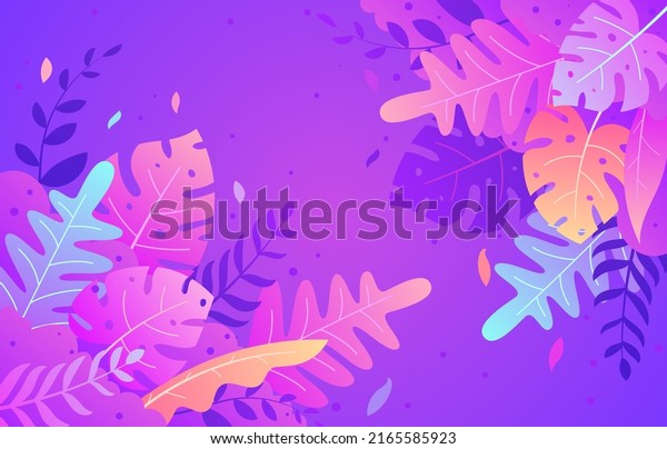
That is, this combination itself, despite all its brightness and unusualness, is quite harmonious and pleasing to the human eye.
They perfectly complement each other, thereby balancing the decoration.
Yellow is the color of joy, positive emotions, and openness. Purple is a complex, ambiguous color.
It consists of red and blue tones that embody the struggle and unity of opposites.
Nature tells us examples of the combination of yellow and purple.

Complementary shades
Let us see how different shades work together.

And let’s start with lighter combinations – yellow and lilac.
Soft combination – there is no drama here.
Because the colors are light and light, fresh and very pleasant.
This combination will not irritate the eye and you can wear jewelry in this range in everyday looks.
Next, let’s take a golden yellow hue as a basis. And details of different shades of purple will easily fit into it.
From light lilac to blueberry. Such wallpaper will look bright, elegant, and sunny.
Because colors that are approximately the same in saturation will always work well.
Purple and yellow wallpaper color scheme
To compare purple and yellow wallpaper color schemes, you can use different shades of the selected color or their similar combinations.
And these are the colors located side by side on the color wheel.
So, orange, green, blue, and pink can be added to the combination of yellow and purple.
But you need to follow the measure so as not to overload your product.

See how the combination of yellow and purple attracts attention.
This combination is expressive and bold enough.
If you decide on such an experiment, you will not regret it.
Try and discover new facets of your creativity, and Wallpaper Kenya will help you with the customization.








Reviews
There are no reviews yet.