


Description
Champagne color wallpaper comes custom-made in various very pale tints of yellowish-orange that are close to beige.
The wallpaper color’s name is derived from the typical color of the beverage Champagne.
The background of the wallpaper can be printed in a delicate “champagne” color.
Champagne color wallpaper is a versatile and elegant choice for walls, offering a sophisticated and timeless aesthetic.
It’s a subtle yet impactful color that can instantly elevate any space, adding warmth and refinement.
The color of champagne (champagne) is a beige-yellow shade in a light range.
Soft, light, and graceful, it comes from the drink of the same name, which has a significant place in the culture of mankind.
The tone closely resembles the color of ivory (ivory), cream, and beige-yellow.
But the color champagne, as a complex derivative of yellow, comes from a basic rich yellow mixed with white and grey, sometimes with a slight admixture of red.
Thus, the powerful expression of yellow as intuition, objectivity, female subconscious, and sociability is dulled by the modesty of gray, its fundamentality.
And from white, it takes on traditionality and motherhood.
Associations with champagne as a ceremonial, often expensive drink, the color acquires the properties of an elite shade.
Therefore, it is not surprising that the champagne shade is often present in wedding themes: dresses, accessories, bouquets, and decorations.
Here are some inspiring ideas for incorporating champagne color wallpaper into your home décor:
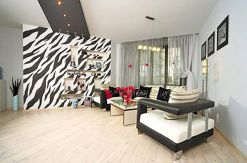
Living Room:
Champagne is always something you drink at celebrations like weddings or New Year.
And therefore, in color psychology, champagne color is also associated with elegance, joy, prosperity, prestige, and sophistication.
The color can also evoke feelings of friendliness, comfort, and fun.
Create a cozy and inviting living room by using champagne color wallpaper as a backdrop for plush furniture, rich wood accents, and luxurious fabrics like velvet or silk.
Complement the warm tones of the wallpaper with pops of color through decorative accents, artwork, or throw pillows.
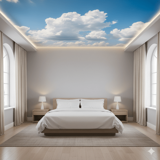
Bedroom:
Transform your bedroom into a serene retreat with champagne-colored wallpaper.
This calming hue will promote relaxation and tranquility, making it an ideal choice for a restful sleep environment.
Pair the wallpaper with soft linens, natural textures, and gentle lighting to create a tranquil atmosphere.
Dining Room:
Elevate your dining room with champagne-colored wallpaper, setting the stage for sophisticated gatherings and intimate meals.
The subtle color will complement a variety of dining table settings, from traditional wooden furniture to sleek modern designs.
Add a touch of glam with metallic accents or crystal chandeliers.
Home Office:
Create a productive and inspiring home office with champagne-colored wallpaper.
The calming and neutral hue will help you focus on work while adding a touch of elegance to your workspace.
Incorporate natural elements like plants or wood accents to enhance the sense of tranquility.
Bathroom:
Add a touch of luxury to your bathroom with champagne-colored wallpaper.
The subtle yet sophisticated hue will complement a variety of bathroom fixtures and décor styles, from classic Victorian elements to contemporary minimalist designs.
Consider pairing the wallpaper with marble accents or polished brass hardware.
Colors to combine on champagne color wallpaper
The champagne color wallpaper is widely used for interior decoration.
Both on walls and decoration, because it can be combined with other brighter and more vibrant tones.
It is a tone that looks like a mix of cream and light brown and usually serves as a base to combine with another color.
Here are some of the best colors to pair with champagne:
Pale pink
If you are looking for a more conservative tone for your home or office, decoration, and flowers, you could mix champagne with pale pink.
This can create a palette of muted colors that will soften and provide an almost ethereal glow to the interior.
Combining pale pink and champagne color wallpaper for walls can create a sophisticated and elegant look that is both uplifting and calming.
The pale pink adds a touch of femininity and romance, while the champagne provides a neutral and grounding base.
This combination is versatile and can be used in a variety of spaces, from bedrooms and bathrooms to living rooms and dining rooms.
Here are some tips for using pale pink and champagne color wallpaper together:
-
Balance the colors: In general, you should use more champagne color wallpaper than pale pink to prevent the space from feeling too overwhelming. A good ratio to start with is 70% champagne and 30% pale pink.
-
Use different textures: To add visual interest and dimension, consider using different textures for the pale pink and champagne color wallpaper. For example, you could use a smooth champagne wallpaper and a textured pale pink wallpaper.
-
Accessorize with pops of color: To add a touch of personality, accessorize with pops of color. This could include throw pillows, curtains, artwork, or decorative accents.
burgundy red
The most daring restaurant wall can combine the champagne color with an intense red.
An apple red is too red and will contrast too much but a deeper one, like burgundy red, will complement the neutral tones.
The combination of burgundy red and champagne color can create a sophisticated, elegant, and luxurious aesthetic.
The deep, rich burgundy red adds a touch of drama and opulence, while the light and neutral champagne color provides balance and refinement.
This color scheme is versatile and can be used in a variety of spaces, from living rooms and dining rooms to bedrooms and home offices.
Here are some tips for using burgundy red and champagne colors together:
-
Balance the colors: To prevent the space from feeling too dark or overwhelming, use more champagne color wallpaper than burgundy red. A good ratio to start with is 60% champagne and 40% burgundy red.
-
Consider the lighting: Burgundy red can appear darker in dimly lit spaces, so ensure adequate lighting to showcase its richness.
-
Incorporate metallic accents: Metallic accents like gold, silver, or brass complement the richness of burgundy red and add a touch of glamor.
-
Add pops of color: To balance the boldness of burgundy red, incorporate accent colors like cream, white, or light blue.
Champagne and silver
Champagne and silver wallpaper is also a timeless and elegant combination that can add a touch of luxury and sophistication to any room.
The warm, metallic hue of champagne complements the cool, reflective tones of silver, creating a visually striking and sophisticated aesthetic.
The versatility of this color scheme allows it to be seamlessly integrated into a variety of décor styles, from traditional to contemporary.
Here are some tips for using champagne and silver wallpaper in your home:
-
Balance the colors: To achieve a harmonious balance, incorporate more champagne-colored wallpaper than silver. A good ratio to start with is 70% champagne and 30% silver.
-
Consider the lighting: The effectiveness of champagne and silver wallpaper depends significantly on the lighting in the room. Ensure adequate lighting to showcase the reflective properties of silver and the warm glow of champagne.
-
Incorporate metallic accents: Enhance the metallic elegance by incorporating silver accents throughout the space. This could include furniture with silver legs, silver picture frames, or silver candlesticks.
-
Add pops of color: To prevent the space from feeling too monotone, introduce subtle pops of color through accent pieces like throw pillows, curtains, or artwork. Consider colors that complement the champagne and silver scheme, such as black, white, or pale blue.
Green
As foliage, green can be a very complementary color for champagne wallpaper.
You can decorate most of the room with green foliage and champagne-colored flowers.
Green and champagne colors are a beautiful and versatile combination that can create a variety of looks in your home.
While green is a refreshing and natural color that can bring the outdoors in, champagne is a sophisticated and elegant neutral that can add a touch of luxury to any space.
Champagne dots wallpaper
Champagne color dots wallpaper is a festive, elevated take on the classic polka dot with hand-painted dots to create a sense of movement and fluidity.
Wallpaper that you can use in many rooms in your home or business, even for children’s rooms.
We have this design in more color options, with other backgrounds and patterns of different colors.
Champagne dots wallpaper is a classic and versatile design that can add a touch of elegance and sophistication to any room.
The delicate pattern of gold or silver dots against a subtle champagne-colored background creates a timeless look that is both understated and eye-catching.
This type of wallpaper is perfect for a variety of spaces, from bedrooms and bathrooms to living rooms and dining rooms.
Here are some of the reasons why you should consider using champagne dots wallpaper in your home:
Elegant and sophisticated:
Champagne dots wallpaper has a timeless elegance that can instantly elevate any space.
The delicate pattern of dots adds a touch of refinement and sophistication, while the champagne-colored background provides a neutral base that allows other elements of your décor to shine.
Versatile:
Champagne dots wallpaper is incredibly versatile and can be used in a variety of spaces and décor styles.
The neutral color scheme makes it easy to pair with a wide range of furnishings and accessories, from traditional to modern.
Timeless:
The classic design of champagne dots wallpaper ensures that it will never go out of style. This type of wallpaper will remain stylish for years to come, making it a worthwhile investment for your home.
Adds a touch of whimsy:
The playful pattern of champagne dots wallpaper can add a touch of whimsy and charm to any room. This is especially true in bedrooms and children’s rooms, where the playful design can create a fun and inviting atmosphere.
Complements a variety of colors:
The neutral champagne-colored background of this wallpaper makes it easy to complement with a variety of colors.
You can use bold accent colors to create a dramatic look or keep things simple with neutral tones for a more understated feel.
Here are some tips for using champagne dots wallpaper in your home:
Consider the scale of the dots:
The size of the dots can have a big impact on the overall look of your space. Smaller dots will create a more delicate look, while larger dots will make a bolder statement.
Choose the right color:
Champagne dots wallpaper is available in a variety of colors, including gold, silver, and even rose gold. Choose a color that complements the other colors in your décor.
Use it sparingly:
Champagne dots wallpaper is a beautiful accent, but it can be overwhelming if used on all of the walls in a room. Try using it on an accent wall or a smaller piece of furniture, such as a dresser or headboard.
Accessorize with other champagne-colored accents:
To tie your décor together, accessorize with other champagne-colored accents, such as throw pillows, curtains, or artwork.
Customizable Shades of Champagne Color Wallpaper
There are many shades of champagne colors from light champagne color to medium and dark shades.
The original champagne color should be somewhere in the middle of all of this and leaning towards a golden and beige look.
All three of these shades of champagne are colors that have been documented in The Dictionary of Color Names (1955) by authors Deane B. Judd and Kenneth L. Kellys.
Color Shade Name Hex Code
Aesthetic Champagne #F3E5CA
Antique Gold #D4C19C
Champagne #F7E7CE
Beige Gold #F2E2C9
Champagne Beige #DBC4A0
Biscuit #DDB591
Champagne Blonde #F0DAC1
Bubbles #E7FEFF
Champagne Blush #E6C4B9
Bubbly #F6E4C6
Champagne Brown #EAC396
Caramel #DFB28D
Champagne Cream #F8E9D6
Cava #F7E4CA
Champagne Rose #DBBEBB
Chardonnay #FFCD8C
Champagne Elegance #F8EEE0
Cream Puff #FFF1D8
Champagne White #F4EFE5
Dark Champagne #C2B280
Champagne Shade #fad6a5
Ivory #fffff0 255, 255,
Champagne Pearl #EADDC7
Dark Champagne Gold #D7C69D
Champagne Silver #DDD1C4
Deep Champagne #FAD6A5
Champagne Frost #E4D8C7
Ivory Cream #DAC0A7
Champagne Gold #FAEEC8
Light Champagne #FAECD7
Champagne Ice #f3e5dd
Ivory Pearl #f6e8ca
Champagne Ivory #FFF8ED
Light Champagne Gold #FAF0D5
Champagne Kiss #e8e4e4
Medium Champagne #F3E5AB
Champagne Mauve #E5C8B5
Old Champagne #f7e7ce
Champagne CMYK #FFE6CB
Pale Beige #DED1B4
Champagne Mist #E8DACD
Pastel Champagne #FCF1DC
Pale Honey #F6D7AB
Champagne Pink #F8DECD
Pearl White #F8F6F0
Pale Gold #E6BE8A
Pink Champagne #F1DDCF
Pale Champagne #F9F0DF
Prosecco #fad6a5
Sand Beige #ae9b7d
Sandstone #786D5F
Soft Beige #DDC7A0
Sparkling Pink #f5cee6
Vanilla Cream #F7E0D2
Wine Yellow #d7c485
Sparkling Wine #efcf98
Reviews
There are no reviews yet.